Most real estate logo design advice online comes from logo-maker tools trying to sell you a template. Pick a building icon, choose between black and white or warm red, done in two minutes. That approach might give you something that looks fine on a screen, but it rarely says anything specific about the developer behind it. This article is part of our broader look at real estate branding in Egypt , focusing specifically on how real estate logo designs work for property developers, with real examples from projects Native Studio has built from the ground up.
What makes a real estate logo design work
A real estate logo needs to do two jobs at once, and most logos only manage one of them. First, it needs to scale. The same mark has to work on a massive construction hoarding on the North Coast and on a tiny app icon on someone’s phone, without losing legibility or impact at either size. Second, and more importantly, it needs to say something about the developer’s positioning, not just look attractive in isolation.
Most property developer logos fall into a handful of common styles: a monogram built from initials, a wordmark that relies purely on typography, a symbol mark using an abstract or architectural icon, a combination of a symbol and a wordmark together, or an emblem with everything enclosed in a badge-like shape. None of these styles is inherently better than another. The right choice depends entirely on what the brand strategy behind the logo actually requires.
Real examples from Egyptian property developers
These three examples show different strategic problems in real estate logo designs, each solved with a different kind of mark.
EHD — a heritage-driven monogram
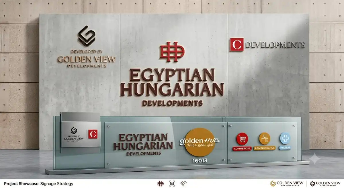
EHD (Egyptian Hungarian Developments) needed a logo that communicated a dual heritage without feeling foreign to a local Egyptian buyer. Native Studio built a bold monogram from the initials, rendered in a deep red with weighted serif letterforms that feel established and considered rather than trendy. The monogram works as a standalone mark on its own, separate from the full wordmark, which gives it flexibility across applications from signage to social media.
Golden View Developments — a refined combination mark for luxury positioning
Golden View needed to signal exclusivity in a crowded North Coast luxury market without shouting about it. The combination mark pairs a restrained geometric symbol with a clean wordmark, avoiding anything ornate or overly decorative. In luxury real estate, restraint communicates confidence far more effectively than embellishment, and the logo had to reflect that from the very first impression.
Common mistakes Egyptian developers make with logo design
The most common mistake in real estate logo designs is choosing a logo before the brand strategy exists. A developer briefs a designer for “something modern and premium” without first answering who the target buyer is or how this project should be positioned against competitors. The result is a logo that looks fine in isolation but says nothing specific once it sits next to five other developers’ marketing in the same area.
The second mistake is overcomplicating the mark. A logo with too much fine detail looks impressive on a laptop screen but disappears into mush when shrunk down to a favicon or printed small on a business card. The best real estate logos tend to be simpler than developers initially expect.
The third mistake is following whatever the developer next door already did. Walk through any new development in 6th of October or New Cairo and the visual similarity across competing logos is striking, the same colour palettes, the same building icons, the same bold sans-serif type. Standing out requires a deliberate decision to look different, not just polished.
How a logo fits into the full brand identity
A logo is the most visible piece of a real estate brand, but it is only one piece. The colour palette, typography, photography style, and brand voice all need to work together with the logo to create a complete identity. None of the three examples above would work as well as they do if the logo existed in isolation from the rest of the brand system.
If you want to understand how logo design connects to the bigger picture of building a developer’s brand, our complete guide to real estate branding in Egypt covers the full process, from strategy through to visual identity and beyond.
Frequently asked questions
Q: How much does a real estate logo design cost in Egypt?
Costs vary depending on whether the logo is part of a full brand identity project or a standalone design. A logo built as part of a complete strategy and identity process typically delivers far more value than a logo commissioned in isolation, since it is grounded in real positioning rather than guesswork.
Q: Should a real estate logo include a building icon?
Not necessarily. Buildings and keys are the most common symbols in real estate logos precisely because they are the most overused. A strong monogram or abstract symbol often differentiates a developer more effectively than another building silhouette.
Q: How long should a logo design process take for a real estate developer?
A logo built on top of a proper brand strategy typically takes two to four weeks once positioning is already defined. Rushing this stage before the strategy is clear usually means revisiting the logo within the first year.
To summarise
A real estate logo design is not just a mark, it is the visible signal of everything the real estate branding strategy behind it has already decided. EHD, APlus, and Golden View each needed a different kind of mark because each developer was solving a different positioning problem. Getting this right starts with the strategy, not the symbol. If you want to see the full picture of how logo design fits into a complete real estate branding guide , that is the natural next step