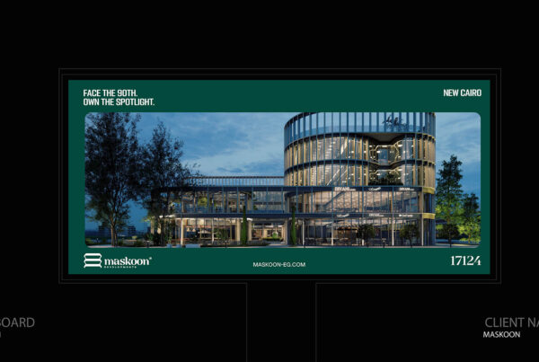

billboard design real estate gets judged in about the time it takes to change lanes. A driver on the Ring Road gives your board a few seconds, and in those seconds the design either plants your name or adds one more lagoon render to a road already full of them. We have sat in enough approval meetings to know where boards go wrong: too many people want something on them. This guide is our answer to that meeting, and it is the design side of every serious branding billboard in Egypt.
Key Takeaways
- Good billboard design real estate does three things in order: it stops the eye, it says one thing, and it leaves the developer’s name behind.
- Seven words is a ceiling, not a target. Fewer usually wins.
- Arabic type needs heavier weights and more space than you think. Thin calligraphic fonts vanish at 80 km/h.
- One master layout, adapted to every size, is what makes ten boards look like one company.
What Is Billboard Design Real Estate?
Billboard design real estate is the craft of turning a developer’s brand into an outdoor board that can be read in about five seconds. A good real estate billboard uses one strong image, a line of seven words or fewer, and a large, clear developer name, all built on the same identity as the website and the sales center.
In Egypt and the GCC, that usually means designing first for the 3×6 portrait board and the Ring Road unipole, with Arabic type heavy enough to read at highway speed.
Why Billboard Design Real Estate Is Harder Than It Looks
A developer is selling something the driver cannot see yet. A juice brand can show the bottle; you are asking a stranger to trust a company and a lifestyle that are still a construction site. That is a strange brief, and it is why most developer boards fall back on the same safe image.
It also raises the stakes. Your board is the most public piece of your luxury real estate branding, and investors read it the way they read a balance sheet: as a signal of how carefully the company runs.
The Render Trap in Billboard Design Real Estate
Most developer boards fail because they all lead with the same render. Drive from Sheikh Zayed to New Cairo and count the boards that show an aerial view, a pool and some palm trees. You will lose count. One study of Cairo’s billboards found that 79% of real estate boards relied on greenery, lakes or imported nature.
The second trap happens in the meeting room. Sales wants the payment plan, marketing wants the amenities, the chairman wants the partner logos, and someone always asks for the hotline. Each request is reasonable on its own. Together they produce a board nobody can read, and the first thing to disappear is the one thing that mattered: the name.
What Billboard Design Real Estate Actually Needs
Strip a good board down and you find three parts: an image that stops the eye, one line that carries the idea, and a name the driver can search later. Everything else is negotiable, and most of it should go.
|
Element |
Its job | What usually goes wrong |
| Image | Stop the eye |
A busy masterplan with no focal point |
|
Line |
Carry one idea about the brand or project | A list of amenities and payment terms |
| Name | Be remembered and searched later |
A small logo fighting three partner logos |
If you have to cut something to make room, cut from the bottom of the client’s wish list, never from these three.
7 Rules of Billboard Design Real Estate
These are the rules we apply to every developer board. Some come from outdoor legibility research; most come from watching what survives on Cairo’s corridors and what quietly fails.
- Write seven words or fewer. Drivers get a few seconds, and on the Ring Road at rush hour they are also watching a microbus. If the line needs a comma, it is probably two lines.
- Size the type for the road, not the screen. As a rough guide, letters around 25–38 cm read from about 90–105 m, and 50–60 cm from 150–180 m. Ask for the site’s real setback before anyone approves the artwork on a laptop.
- Use contrast you can see in a dust storm. Dark on light or light on dark. Never put text over a busy render, and check the board at dusk, when half of Cairo actually sees it.
- Pick Arabic type that survives distance. Heavy, open letterforms with generous spacing. Decorative calligraphy looks beautiful in the presentation and turns into a smudge at 100 m. On a bilingual board, let one language lead.
- Make the name the second thing people see. The image earns the glance; the name has to catch it right after. Test your real estate logo design at billboard scale, not on a business card.
- Choose one image with one focal point. An entrance, a facade detail, a person on a balcony. A full masterplan asks the driver to study it, and nobody studies a billboard.
- Match the call to action to the speed. On a highway, the name is the call to action. QR codes and short links belong on slow streets and mall entrances, where people can actually stop.
Not sure your current boards pass these rules? Send us the live artwork and we will review it against your brand system before your next renewal. Request a billboard design review.
Call us Whats appBillboard Design Real Estate Across Egypt’s Formats
Design one master layout and adapt it, rather than designing each size from scratch. The 3×6 portrait board is the most common size in the country, at roughly 40% of the 12,000 or so large faces across Greater Cairo, Alexandria and the Delta, according to AdMazad data reported by Enterprise. In billboard design real estate, that one format deserves its own version of your layout.
|
Format |
Where you see it | How the design adapts |
| 3×6 portrait | New Cairo, Sheikh Zayed, inner roads |
Logo stacked above the line, tall image crop |
|
Landscape unipole or mega board |
Ring Road, Mehwar, Suez Road | Wide image, line on one side, very large name |
| Bridge banner | 6th of October Bridge, flyovers |
The shortest copy you have, read head-on |
|
Digital screen |
Major corridors and malls |
8–10 second slot; the first frame must work alone |
When One Developer Runs Several Projects
A developer with five projects on the road can look like five unrelated companies, and that is expensive. Each campaign ends up competing with the developer’s own last campaign.
In billboard design real estate, the fix is a shared grid: the master brand sits in the same place, at the same size and in the same typeface on every board, while each project gets its own color or mood. It sounds rigid. In practice it is what lets a buyer connect a board in Sheikh Zayed with one on Suez Road and think “same people.”
How Native Studio Approaches Billboard Design Real Estate
We design the board inside the identity system, then test it at road speed before anything gets printed.
- Start from the brand guidelines. The platform line, the grid and the lock-up already exist, or they get built first.
- Sketch from the site, not the screen. Type and logo sizes come from each site’s real setback.
- Run a five-second test. We borrowed it from a Lamar Advertising guide published by the Oregon Department of Transportation: show the design for five seconds, hide it, ask what people remember. If they remember the render and not the name, we cut.
- Roll the master out to every size in the media plan.
- Proof on vinyl and on LED separately. Colors shift differently on each, and the client’s brand red should not turn orange on the 6th of October Bridge.
All of this sits inside our branding and campaign services, because a board designed outside the brand system rarely stays on brand for long.
Call us Whats appProof: Two Projects, Two Design Problems
Sumou Gate project shows these rules on a real board. The headline is five Arabic words, «بوابة سمو بداية تجربة مختلفة», set in a heavy, open typeface that holds up at distance, with one short line underneath. The English tagline is there, but small, so Arabic clearly leads. One interior shot carries the image side and a single brand color fills the rest, which gives the eye exactly one place to land. In billboard design for real estate, that restraint is the hard part: the board says what the project is and stops.
 EHD (Egyptian Hungarian Developments) is a lesson in restraint over time. The identity was refined step by step to earn the trust of boards and investors, keeping what the market already recognised. Billboards need the same discipline: when an identity evolves, the boards should evolve with it, not jump to something the market has never seen.
Executive FAQs
How many words should a real estate billboard have?
Seven or fewer. Industry guidance puts the ceiling around nine, but Cairo's corridors are busier than the roads that guidance was written for.
Should the board lead with the render or the logo?
The image stops the eye, the name is what has to stick. In billboard design real estate, use one focused visual and make sure the developer or project name is the clear second read.
Arabic or English?
Whichever your buyer thinks in. Both can work, but split the space evenly and you halve the size of each, so let one lead.
What is the most common billboard size in Egypt?
The 3x6 portrait, at around 40% of large faces in Greater Cairo, Alexandria and the Delta. Design for it first.
Do I need a phone number on the board?
Only where traffic is slow enough to write it down. On a highway, a name people can search later does more work.
Conclusion: Design for the Glance, Brand for the Memory
Billboard design real estate is mostly about saying no: one image, one line, one name the driver cannot miss, built on the same system as the rest of your brand. Do that, and every new board adds to the last one instead of competing with it.
Have artwork going to print soon? Book a design review with Native Studio before the vinyl is printed.
Call us Whats app